DESIGNATION
User research, strategy, IxD
Develop product strategy and prototype
Prototyped and pitched
March 2016
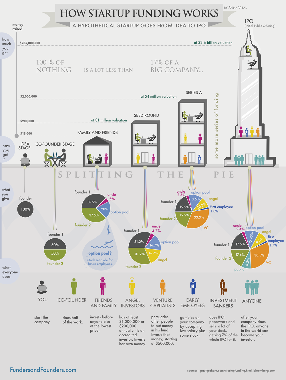
In October 2015, The U.S. Securities and Exchange Commission voted to approve the final rules permitting companies to offer and sell securities through online equity crowdfunding. Small and medium-sized startups with limited access to high stakes investors could now raise capital for their enterprises by offering equity to anyone, rich or poor, accredited or unaccredited.
Our challenge was to create an online crowdfunding platform for startups, where any entrepreneur can post their business idea or existing business and raise money.
Given that this was a concept project, we first had to educate ourselves on the startup and crowdfunding spaces. We decided to explore some preliminary domain research. With the insights from our research, we were able to generate insights that we could further validate through user interviews and surveys.
Our first step was to gather all the information we could find on the startup, crowdfunding and legislation domains. identifying the overlaps and impact of new legislation on the crowdfunding space was key in how our product would shape. In our first attempt at doing real domain research, we had no idea where to start. We were overwhelmed by the broadness of scope and by the idea that we had to become “experts” in all these fields within 48 hours.
We started by combing through the Title III legislation and related articles that described its impact on crowdfunding. Using this knowledge as a jumping off point, we asked our visual designer with prior trading experience, Justin, to give us a crash course in equity and investments. Leveraging his network of investment professionals and my own network of startup founders, we were able to round up candidates to interview as subject matter experts in order to gain first hand knowledge into the domain.
The professionals we interviewed had an average of 10 years experience in the field, and were further able to point to credible articles in startup funding, investor strategy, and crowdfunding.
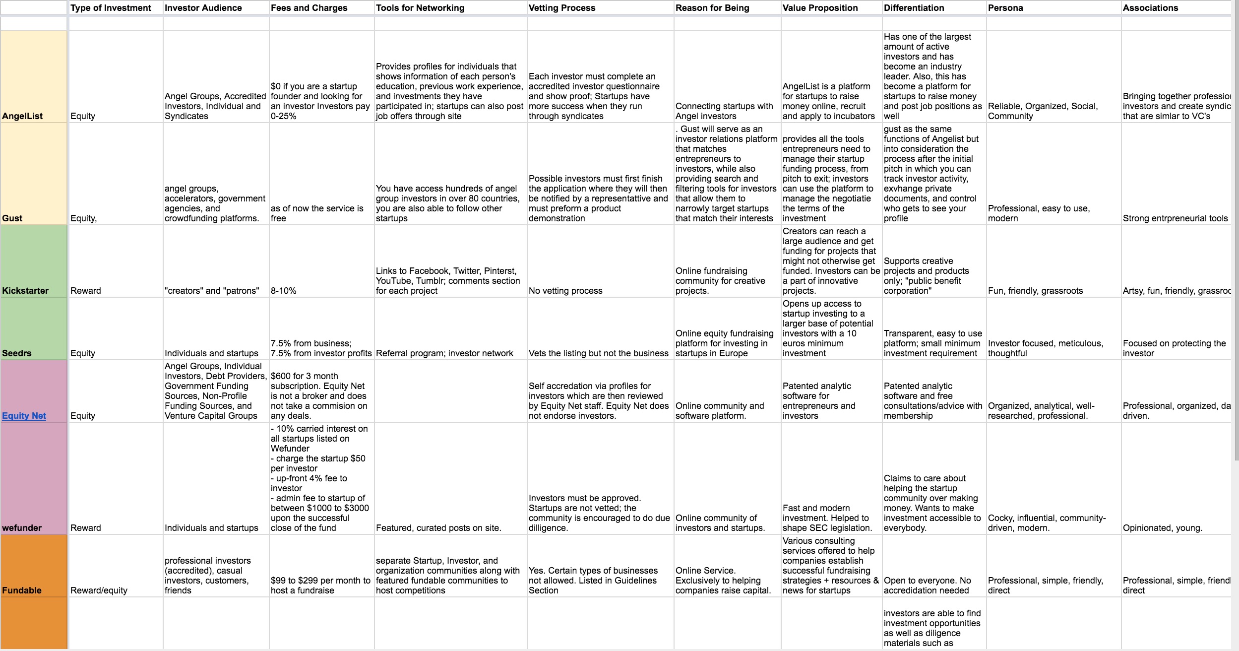
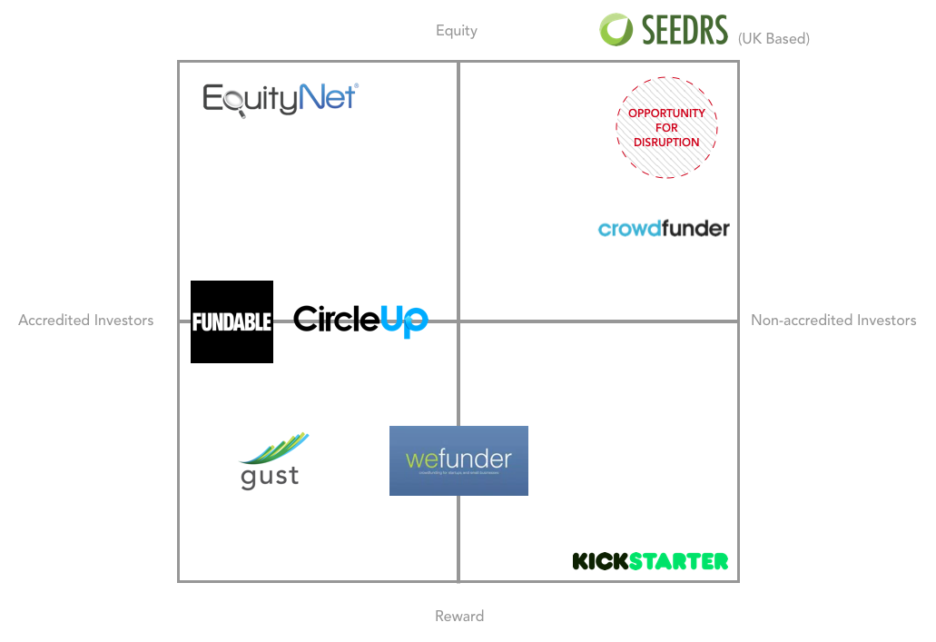
We needed to gain a better understanding of the current crowdfunding landscape; what services already existed and where opportunities lay for disruption. To achieve this, we conducted a competetive market analysis of the crowdfunding space.
As a first step, we organized our data by putting together a feature comparison chart of successful features and weaknesses across existing platforms in the crowdfunding space. The trends we saw from our feature comparison chart were pooled to create a SWOT analysis, and eventually a competitive landscape chart, which gave us the visual insight we were looking for in where our competitors lie, and where we could make the greatest impact.
Our domain research left us with many unanswered questions and unvalidated assumptions. We needed answers from real users in order to validate our assumptions and answer our follow-up domain research questions.
We decided to conduct user research as a means to understand the lifestyles and motivations of real users targeted to use the system. With a wide variety of research tools and methods at our disposal, we had to focus the scope and choose the best methods that would harvest the most insight in the shortest amount of time. We created a research plan outlining the research methods we found appropriate.
Our primary goal with quantitative research was to answer broad sweeping questions pertaining to our target users’ investment practices
We designed a 10-question survey that asked users about their current investment practices, knowledge of the startup world, and experience with crowdfunding platforms. This was sent out across various social media channels and our personal networks to achieve the largest sample size possible.
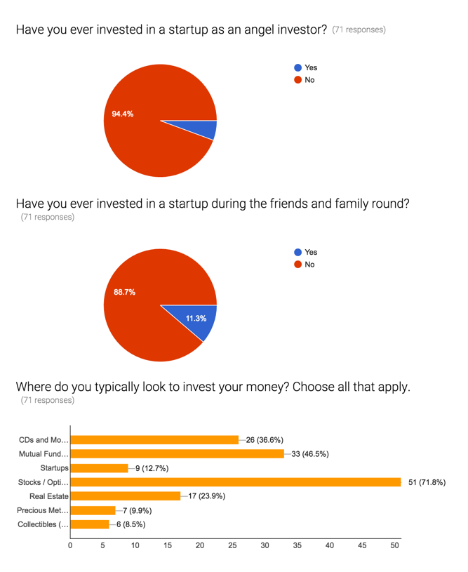
Our original assumption of the assumed awareness of opportunity people thought they had was invalidated. Users were not aware of these investment opportunities or how to take advantage of them. A certain degree of education in crowdfunding and investing would be necessary.
We conducted user interviews as part of our qualitative research. The interviews focused on gaining insight into how users actually felt about crowdfunding and where their emotional reluctancies lie in buying into such a system.
While we had an idea of the questions we wanted to ask, we anticipated the search for the “ideal” user would be difficult considering we didn’t quite know what the ideal user looked like. To circumvent this speed bump, we decided ahead of time to include a question on our survey asking if participants would be interested in participating in further research. Once we had a rough idea of the demographic background of the majority of the survey respondents, we were able to consult this list and our personal networks to source potential interview candidates.
Having fully diversified our quantitative and qualitative research efforts, our goal now was to synthesize and understand all our insights. We felt well equipped to accurately define who our users were, how they behaved, and what their frustrations were.
Much like our competitive market analysis, we had a lot of information, but no visual representation of our findings for our own understanding and communication purposes. To achieve this, we created proto-personas to align ourselves against for the duration of the project.
For each persona, we made sure to call out their respective user goals, frustrations and motivations. These deliverables would also come in handy when communicating our research findings to interested parties outside of our team.


We noticed a particular theme in our investors’ frustrations and identified that as the overarching problem that needed to solved.
Young professionals want a way to invest their spare income confidently in opportunities that have the potential to benefit society and generate social and financial gains.
Having defined the problem, our goal was to start solving it. Before going down a feature well, however, we had to lay down some ground rules in order to maintain focus and eliminate the possibility for extraneous features to slip inside. We decided to create a set of product values that would serve as guardrails during the ideation phase.
Product values ensure that any decision made in regards to the product (from features, content structure and copy to layout, color and typeface) align themselves to the core needs of the target user and the overarching problem trying to be solved.
The product values we created in this specific instance sprouted from our insights on the needs and frustrations of the inexperienced investor.
Show me the money
In order for users to feel safe in their decision making, the system should promote legitimacy, security and transparency in the information presented by both parties (startups and investors).
I'm a big kid now
The system’s content and visual structure should promote independent albeit well-informed decision making. The user should feel educated enough to make investment decisions confidently across the platform.
Come on in, we're open!
The system should allow users to feel less intimidated and more like a part of the businesses they’re investing in, and transversally the communities they are trying to benefit.
More money more goodness
Users are aware of and put off by the financial risk of losing money in equity crowdfunding. The idea of investing towards a good cause alleviates the stress of “throwing money down the drain”. Therefore, content related to startup ventures (along with the ventures themselves) must align to a particular social impact cause.
No Suit Zone
Investing is no longer a suited old man’s game. The system’s visual language should convey youth, relevance and authority while remaining casual, contemporary, and modern.
With our product values in place, it was now time to identify a core feature set with which we could concept a solution.
One lingering frustration that we felt from our user interviews was that users placed seemingly equal value on information consumption vs social validation.
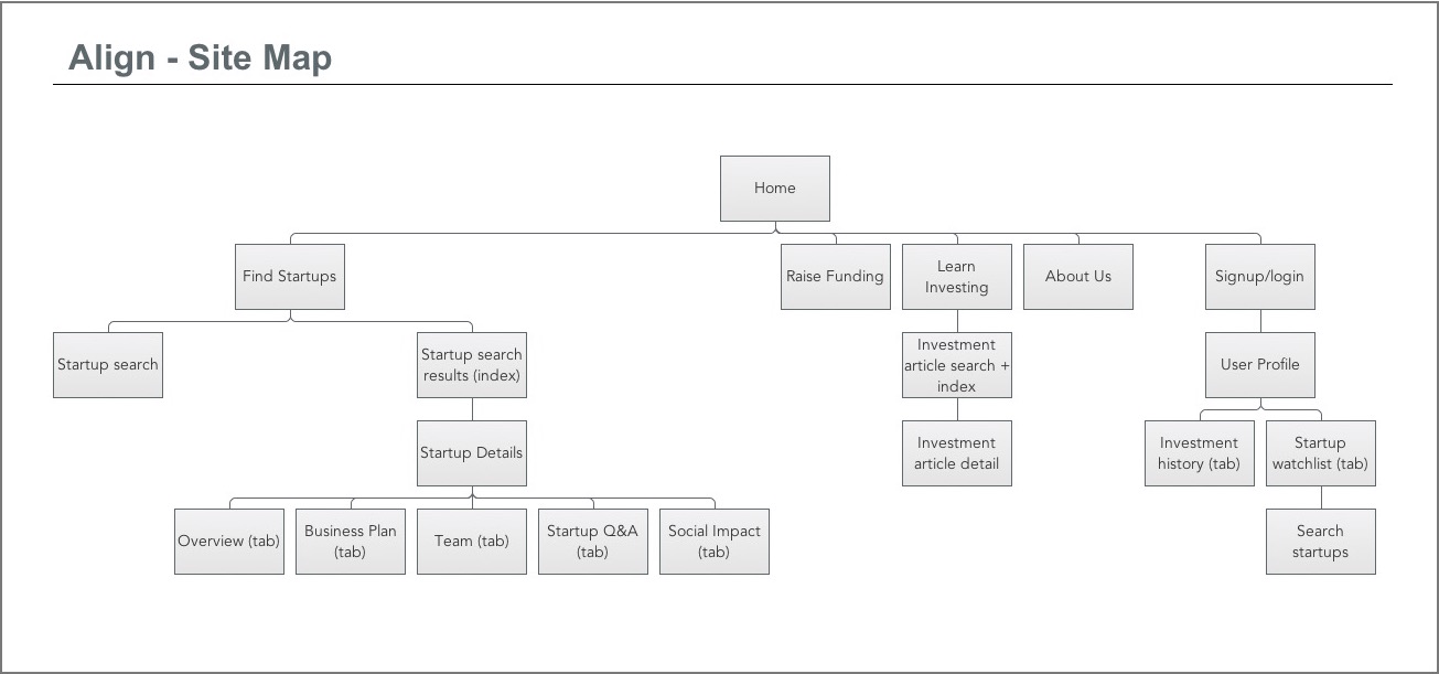
In order to figure out what users valued more, we decided to split off and draft two concepts with polarized focuses. On the one hand, we decided on a mobile concept which placed a heavier emphasis on interacting with a larger investor network. On the other hand, we decided on a web concept with heavier emphasis on startup and investment content consumption. It was my responsibility to flesh out the web concept. My first step was to create a site map outlining content and feature hierarchy. These would later aid in creating wireframe prototypes.
During this particular phase we learned the value of diversifying our solution spectrum in order to understand which ideas resonated best with users. With our content hierarchy in place, we now had to create a lo-fi wireframe prototype for user testing.
There were a good number of learning moments during this phase. The first of which came with having to learn new software. In order to maintain uniformity amongst the team, we decided to use Sketch to build the wireframes. This, however, meant I had to learn a completely new prototyping tool in 48 hours. The screens I chose to focus on were the landing page, startup search index, startup details and investor profile.
While the site map took care of content structure across the app, I had very little time to come up with a content structure for all the individual pages. I put myself through an exercise where I wrote down all the content for a particular page from top to bottom. I then used this as a foundation to build out my content hierarchy for that page, floating certain pieces of information to the top as needed in order to draw the user’s attention.
View wireframe prototypeNow that we had two concept prototypes, our goal was to obtain information suggesting which of the two concepts was stronger. We did this by placing both concepts in the hands of a real users, and asked them to tell us which experience best solved their problem. Amongst the rest of the team, this had been our first time running concept validation tests. Our struggle lay in knowing how to structure our test in order to minimize user bias and obtain objective, conclusive results.
We decided to structure our usability test around a set of test parameters to control the context under which the test would be administered;
We now had to take the key features from previous testing and craft an improved experience. At this point, we were still unsure as to whether to continue with a web or mobile. If we chose to go either way, how would do we elegantly fit in features concepted for the other platform?
This was one of our more conclusive test results. Users preferred conducting investment and monetary transactions over a web platform as opposed to a mobile concept. We decided to keep the basis of my web concept, build on that to include successful features from Michelle’s mobile concept.
We learned through this that while it might be personally tough to include another designer’s work into your own, constantly referring back to the data and keeping the focus on the success of the product makes these conversations easier, and opens your mind up to embrace the contributions of others.
With the wireframes as “finished” as we could have hoped for, our UX team had to now handoff wireframes to UI designers and provide ad-hoc changes as needed. Providing post handoff support on a project was no surprise to me as I had grown accustomed to this expectation during my days as a software engineer.
Our goal with this round of usability testing was to identify which of two visual styles users preferred. Our frustration arose here when we were not provided any sort of template for usability testing. We had to create one from scratch.
Creating a test plan was no strange task for me. In this endeavor, I relied on my prior experience as a Software Test Engineer, and leveraged that along with my newly acquired knowledge on user-centered design to write a test plan that explained the who, what, when, where, why and how’s of our usability test administration. This was later reviewed and approved by a professional usability expert. Through testing, we learned that users preferred Justin’s visual concept as it felt more structured and contemporary.
With our concept fully fleshed out, it was time to present final concept to a panel of experts. Having performed as a competitive dancer in front of large audiences before, presenting myself in front of a large crowd didn’t seem like an intimidating task. It was here that I also played the role of a presentation mentor (or more so team cheerleader), providing encouragement to members of my team during stage-fright driven moments of anxiety.
We closed our presentation with a note about future considerations. These included opening up the platform to sectors beyond social good, and potentially including brick -and-mortar business to drive local engagement.
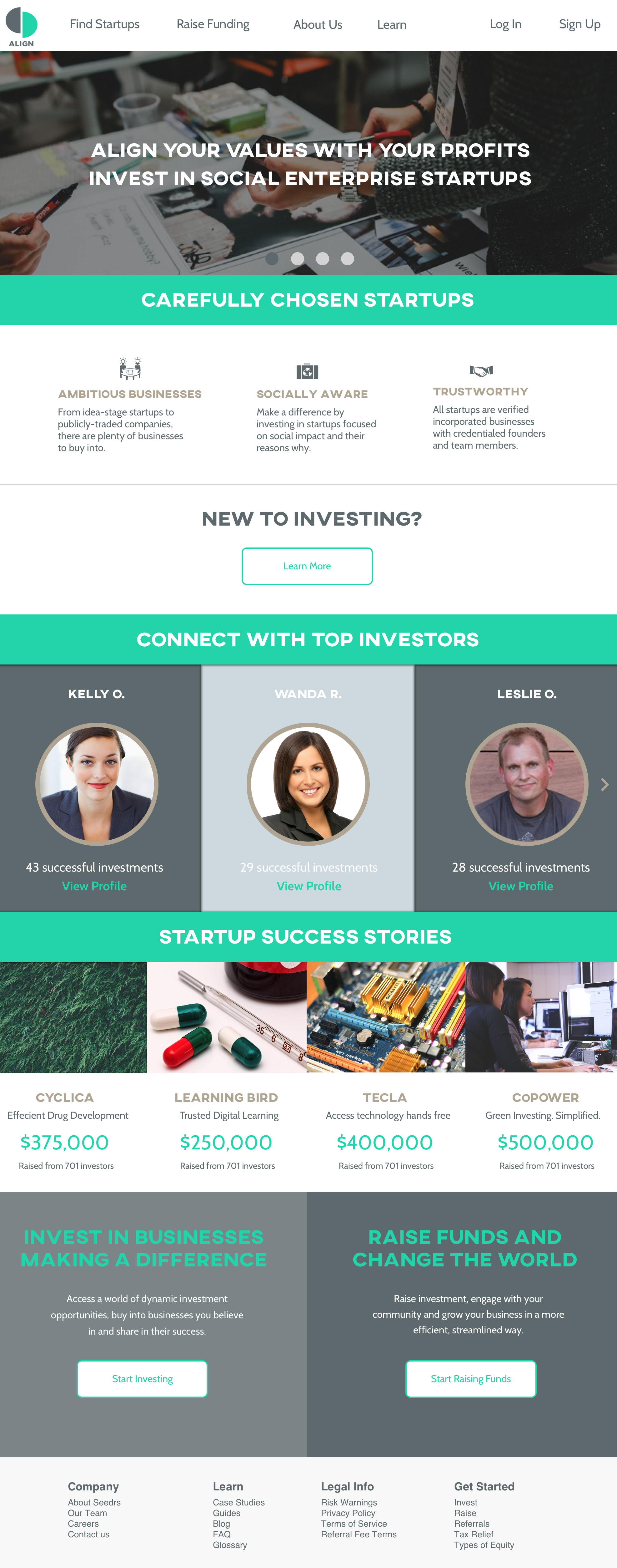
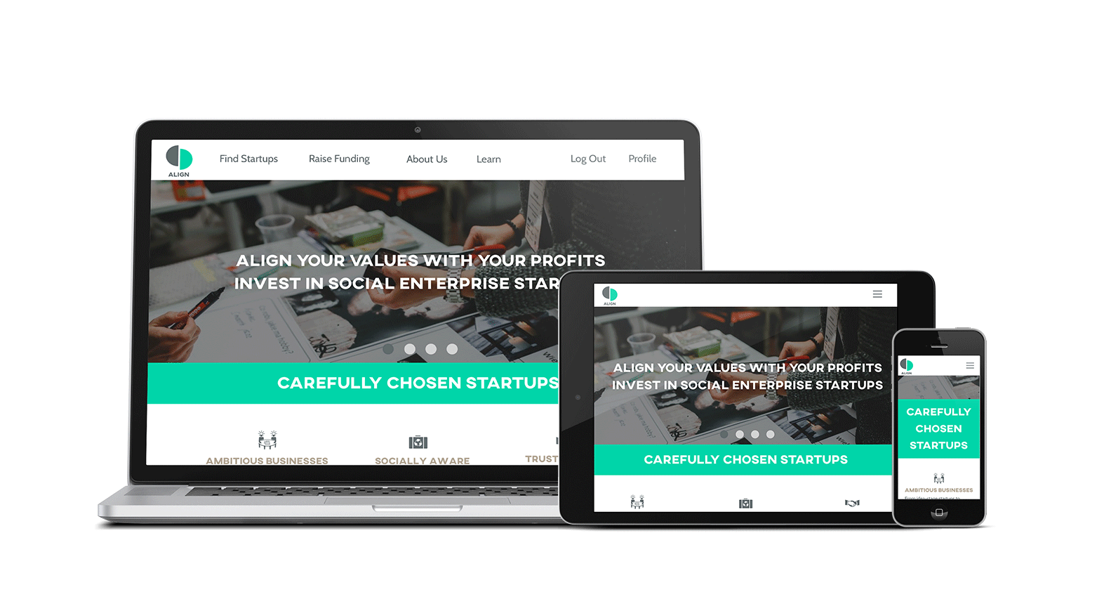
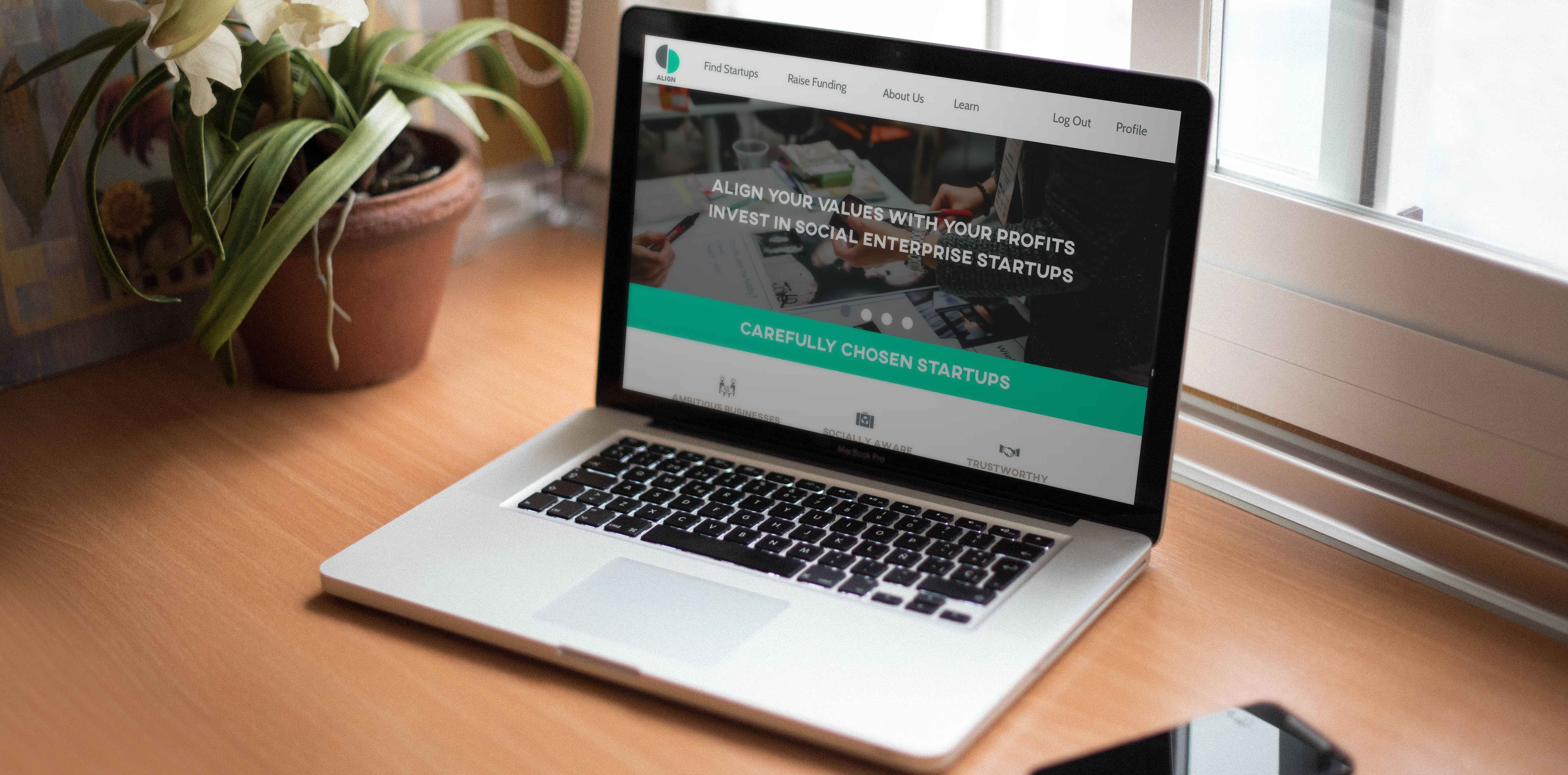
Landing Page
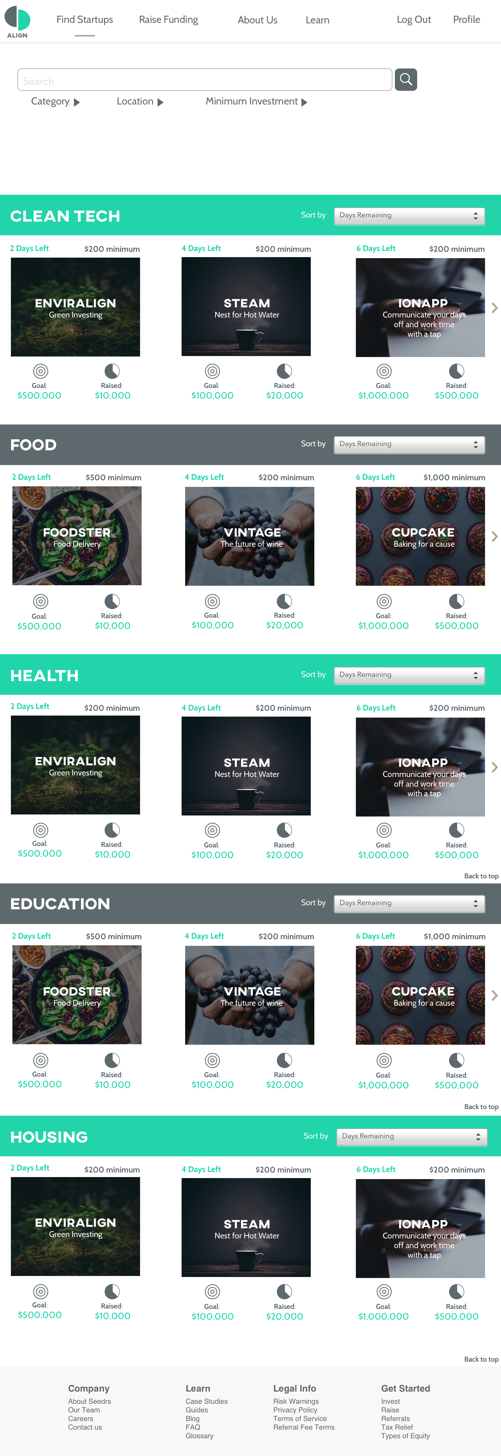
Startup search results
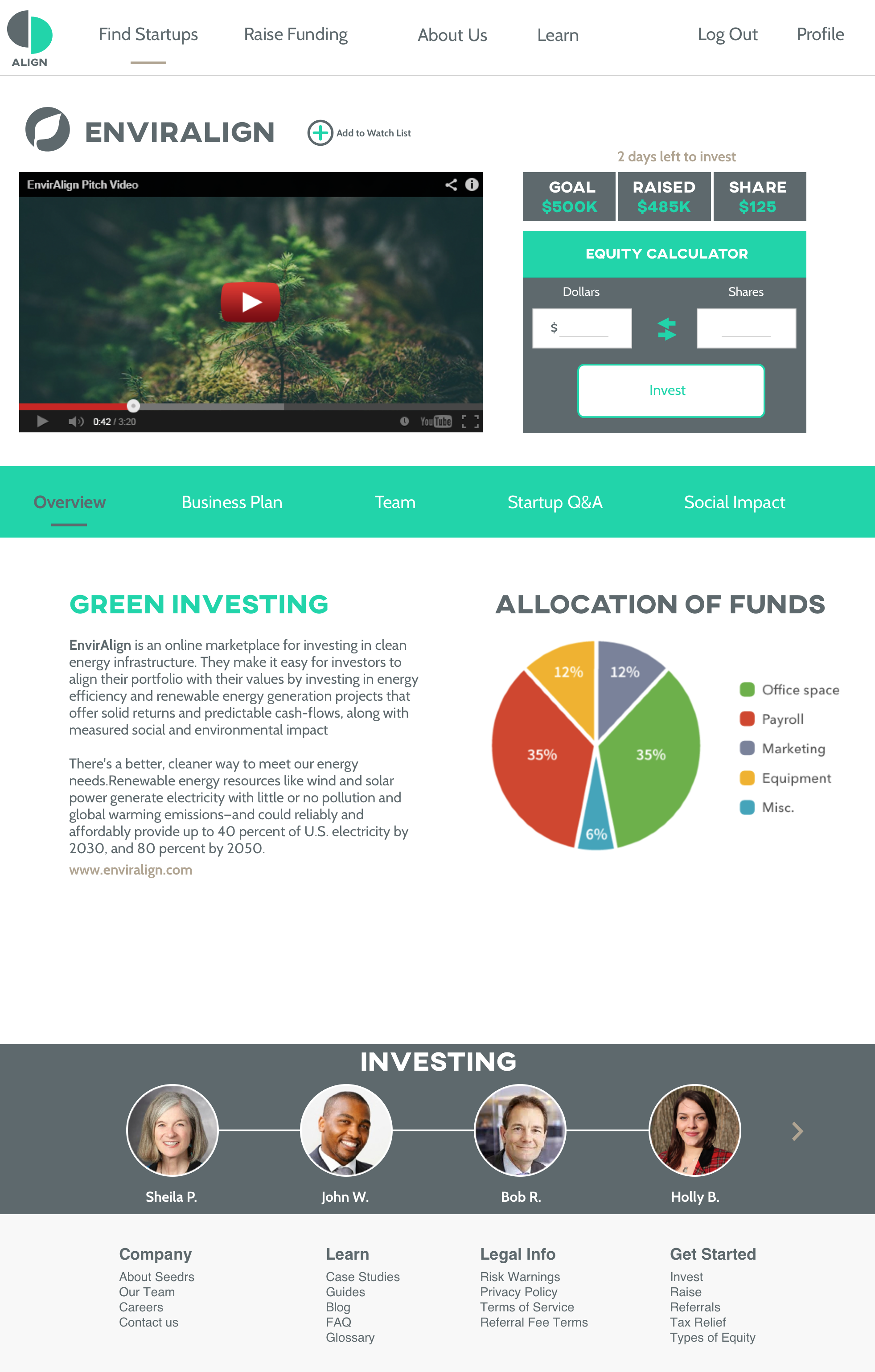
Startup details
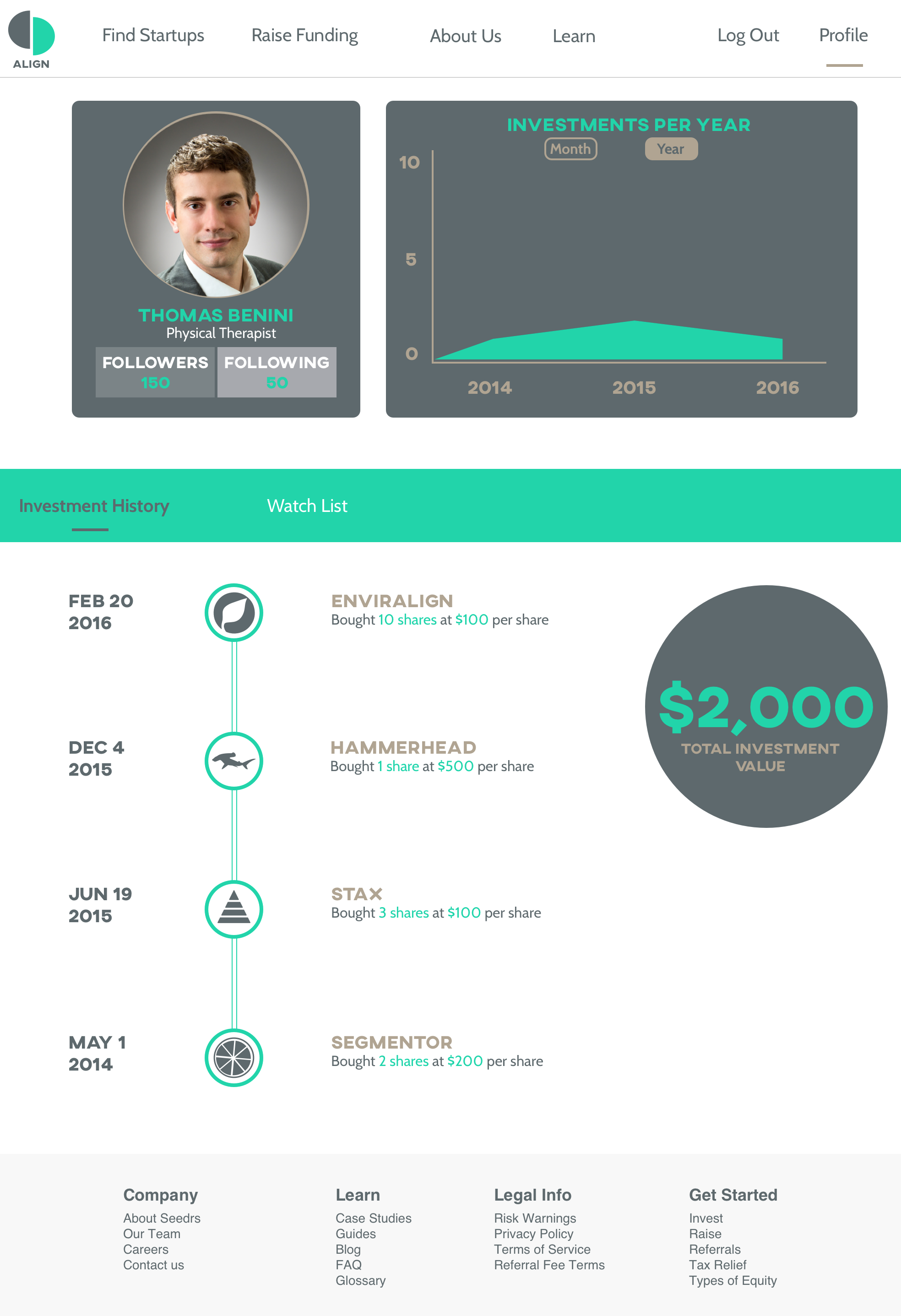
Investor Profile
In looking back on the experience, there were a lot of learning moments that our team took away from. Some of these lessons included:
The idea of becoming an “expert” in a domain as a UX designer is a glamorized phrase. In no way did our 48 hours of research across four domains equal the breadth of knowledge professionals with 10+ years of experience had. We realized the key here was to leverage their experience to find trends in their work patterns, motivations, pain points, and general opinions on the intervention of technology.
Given the short timespan we had to recruit and conduct user interviews, we relied heavily on our own personal networks to source candidates. This was quite difficult for an introvert like myself, but by using “research” as a use case to step out of my shell, I was able to appreciate the extent of the depths in my network and value its growth and maintenance.
A product is never finished. It is merely another iteration in a series of prior iterations; a refined experiment only to be refined further by subsequent experiments. To consider your work “finished” at any point directly conflicts with this product-view, and influences your inability to let others experiment and refine your work, which is where the true power of product design lies.
My takeaways from this project would influence my approach to solving problems in my next project, Hire Me Direct.
Email me at venkat.k.murali@gmail.com